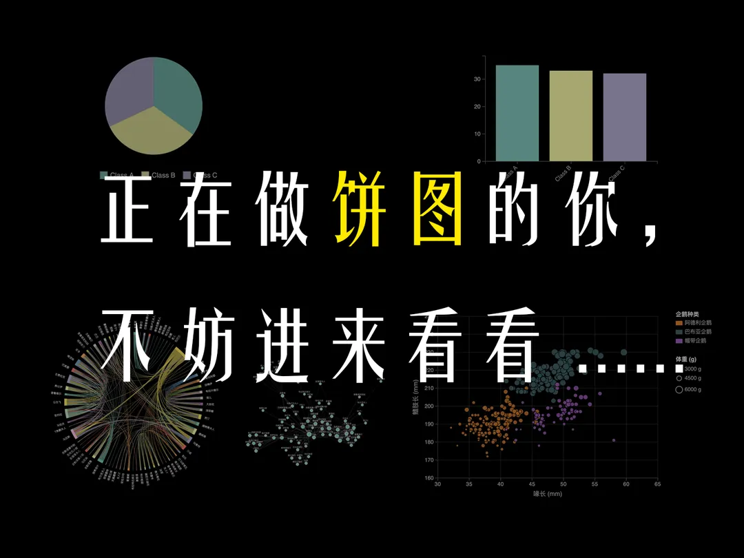
Beyond Intuition: How Visualization Research Helps Us Understand Chart Effectiveness
A research-driven look at pie charts, analytical tasks, and how we know what works in data visualization.
6/7/2025
🐸
In our first episode on Data Visualization, we touched upon foundational research by Cleveland and McGill (1984) suggesting that bar charts often allow for more accurate perception of data compared to pie charts. This sparked a great deal of discussion. In fact, 52% of viewers voted for pie charts in the poll. Some viewers rightly pointing out that pie charts seem intuitive for certain tasks, particularly for understanding proportions.
This feedback is invaluable, as it highlights a core challenge and a vibrant area of inquiry in the visualization research community: How do we move beyond gut feelings to systematically understand which charts work best, for what purposes, and why? This post delves deeper, not to definitively declare winners or losers in the “chart wars,” but to showcase how researchers investigate these questions. Our goal, much like in our video series, is to empower viewers with the ideas of understanding visual perception through careful thought and experimentation.
What Are We Actually Doing With Charts?
When we look at a chart, what question are we trying to answer? Are we looking for the largest value? Trying to see a trend? Comparing two specific points? Visualization researchers recognized that to evaluate a chart’s effectiveness, we first need a clear language to describe these “analytical tasks.”
A seminal work in this area is “Low-Level Components of Analytic Activity in Information Visualization” by Amar, Eagan, and Stasko (2005) (PDF Link). They proposed a taxonomy of ten low-level analytical tasks that users perform with visualizations. These include:
- Retrieve Value: Reading a specific value associated with a data point (e.g., “What percentage does Category A represent?”).
- Filter: Finding data items that satisfy certain conditions.
- Compute Derived Value: Calculating a new value from one or more existing data values (e.g., “What is the sum of Categories B and C?” or “What is the proportion of A to the total?”).
- Find Extremum: Finding the data item with the maximum or minimum value.
- Sort: Ordering or ranking data items.
- Determine Range: Finding the span of values for a given set of data items.
- Characterize Distribution: Understanding the overall spread, central tendency, and shape of the data.
- Find Anomalies: Identifying outliers or unexpected data points.
- Cluster: Grouping data items with similar properties.
- Correlate: Assessing the relationship or dependency between two or more variables.
This taxonomy provides a crucial framework. Instead of vaguely saying a chart is “good,” we can ask, “How effective is this chart for the task of Retrieving a Value?” or “Characterizing a Distribution?”
Mapping Pie Chart Questions to Low-Level Tasks
Let’s revisit some common scenarios where pie charts are often considered:
-
“Understanding proportions” (e.g., “What percentage of the budget goes to marketing?”):
In Amar et al.’s taxonomy, this primarily maps to Retrieve Value.
-
“Comparing a dominant part to a group of smaller parts (when smaller parts are adjacent to each other)” (e.g., “How does spending on ‘Salaries’ compare to the combined spending on ‘Operations,’ ‘Travel,’ and ‘Supplies’?”):
This involves Retrieve Value (for ‘Salaries’) and then Compute Derived Value (summing the smaller categories, then comparing the two values).
-
“Getting a ‘gist’ or ‘initial coarse understanding’ of the data”:
This is a broader goal. It could involve quickly attempting to Find Extremum (largest/smallest slice), roughly Characterize Distribution (e.g., “one big slice, many small ones”), or perform a series of quick, imprecise Retrieve Value operations.
How Do Pie Charts Fare? Insights from Empirical Studies
With tasks defined, researchers can conduct experiments to measure how well different visualizations support them.
-
The work of Cleveland & McGill (1984) (PDF Link) was a pioneering effort in quantified and systematic comparison of graphical perception. Their findings suggested that bar charts are better than pie charts for comparison judgments.
-
Simkin & Hastie (1987) in “An Information-Processing Analysis of Graph Perception” (PDF Link), conducted experiments specifically comparing pie charts and bar charts for tasks of estimating proportions and comparing components. They found that for proportion judgments, pie charts were generally as accurate as bar charts, sometimes even more accurate at the cost of judgement time. However, for comparisons between individual components, bar charts were faster and more accurate, replicating the results from Cleveland & McGill (1984).
-
More recently, Saket, Endert, and Stasko (2016) in “Task-Based Effectiveness of Basic Visualizations” (PDF Link), evaluated various common chart types (including pie charts) across several of Amar et al.’s analytical tasks. Their study provides valuable empirical data. For example, they found pie charts can be as effective as other visualizations for task types such as Cluster, Extremum, Filter, Retrieve, and Range. However, for tasks like Correlate or Characterize Distribution tasks, other chart types were generally more effective.
The collective body of research doesn’t offer a simple “always use X” or “never use Y.” Instead, it provides evidence to guide our choices:
-
Pie Charts and Proportions: For the specific task of understanding a part’s proportion to the whole (Retrieve Value of a proportion), research suggests pie charts can be effective, aligning with common intuition. (Simkin & Hastie, 1987; Saket et al., 2016).
-
Consider Alternatives for Comparisons: For tasks requiring precise comparison between individual categories, bar charts are generally recommended due to the superior accuracy of position judgments (Cleveland & McGill, 1984; Simkin & Hastie, 1987).
-
Use with Awareness: For some tasks like Cluster, Extremum, Filter, Retrieve, and Range as tested in Stasko et al., pie charts can be as good as other chart types. If your intended tasks for the chart are within those categories, or the “part-to-whole” metaphor offered by a pie chart strongly resonates with your audience, pie charts are fine to use, but be aware to:
- Avoid 3D pie charts. The perspective distortion makes accurate proportion judgment nearly impossible and can be actively misleading. (We can explore why 3D charts are problematic in a future post.)
Embracing the Research Mindset
The most important lesson from this exploration isn’t a definitive ruling on pie charts. It’s an appreciation for the process of visualization research: the careful definition of analytical tasks, the design of controlled experiments, the measurement of human performance, and the gradual building of an evidence base.
This scientific approach helps us move beyond mere preference or tradition and make more informed decisions about how to best represent data for human understanding. The findings from these studies are valuable guides, but they should always be applied thoughtfully, considering the specific context, audience, and goals of your visualization.
Want to Dive Deeper?
For those interested in a broader overview of how visualizations are evaluated, the survey paper “A Survey of Perception-Based Visualization Studies by Task” by Quadri & Houssami (2021) (PDF Link) offers a comprehensive look at the field.
We hope this provides a clearer picture of how the visualization community thinks about chart effectiveness. If you have further questions or thoughts, feel free to contact us through email.
References
- Amar, Robert, James Eagan, and John Stasko. “Low-level components of analytic activity in information visualization.” IEEE Symposium on Information Visualization, 2005. INFOVIS 2005. IEEE, 2005. (PDF Link)
- Cleveland, William S., and Robert McGill. “Graphical perception: Theory, experimentation, and application to the development of graphical methods.” Journal of the American statistical association 79.387 (1984): 531-554. (PDF Link)
- Quadri, Ghulam Jilani, and Paul Rosen. “A survey of perception-based visualization studies by task.” IEEE transactions on visualization and computer graphics 28.12 (2021): 5026-5048. (PDF Link)
- Saket, Bahador, Alex Endert, and Çağatay Demiralp. “Task-based effectiveness of basic visualizations.” IEEE transactions on visualization and computer graphics 25.7 (2018): 2505-2512. (PDF Link)
- Simkin, David, and Reid Hastie. “An information-processing analysis of graph perception.” Journal of the American Statistical Association 82.398 (1987): 454-465. (PDF Link)